Good in Grey
This is the latest article written by the wonderful Sally Morse from Hunter Douglas:

Whether you spell it grey or gray (I prefer the former), everyone knows this color is a major player in the design field. Grey can land anywhere on the color spectrum from cool and light to dark and deep, making it a hue that can stand on its own or influence other colors in a room.
On the lighter, cooler side of things, the color grey goes by names like Silver Mist, White Stone, Cement, or Platinum. These cooler grey tones work well as a grounding color to lighter pastels, making the whole look less sugary sweet. Mixed with mid-toned shades, grey adds weight and a contemporary feeling. Mixed with deeper toned colors, cool grey becomes more of a neutral background color, almost disappearing as it steps aside for the deeper colors to take center stage.
The warmer, deeper greys work great with more saturated colors. Pewter, Steel Wool, Stormy Grey, and Charcoal Grey are common names for colors in this deeper toned category. I recently saw a fabric that used a combination of dark grey, emerald green, and sunny yellow. The grey again became the neutral color, but added a richness that a beige color wouldn't have been able to.
We also see grey used to make colors more complex. For example, take the color beige, add grey, and you'll get a delightful chameleon color that might look taupey or beige/grey (otherwise known as greige). It all depends on what you put with it. This range of colors is what I call transitional colors, and they work well in hallways and spaces where you are transitioning from one living area to another. Think of them like a bridge connecting one space to another, where each might have totally different color schemes going on. These more complex grey tones help neutralize without being bland or boring.
Grey is also a wonderful color metalized—think of the shine of silver or plated silver. In this instance, grey becomes more formal because of its sheen. It's the same for platinum designed accessories mixed with crystal. They are the height of elegance and formality. Pewter is another color in the grey family that can add appeal. It is warmer than silver, but also more casual, which means it can dress down a room but still add some visual interest with its subtle sheen. Grey accessories like mercury glass are another way to bring this color into your home. I love the glow of mercury glass candleholders and the various shapes that are created from the light.
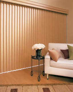
Have you noticed the influence of grey on wood tones? From the furniture market to the window covering industry, lighter wood tones take a cue from the color grey. The look isn't an all-over grey finish, but leans more toward an artisan look with some veins or slats that are grayer, while some others might be more beige. This multi-toned approach has more variety to it across all sorts of wood tones, and is a bit more palatable than the look of black painted furniture, which can be quite stark. With the exception of dark woods (like mahogany or cherry), grey is making itself well known.
With the popularity of nickel and stainless steel in lighting, tile, appliances, and accessories, I don't believe grey is going anywhere anytime soon.
Hunter Douglas has more than 50 shades of grey available to you. A few of my favorites include Pirouette® window shadings, which have Starlight, Pagoda, and Cosmopolitan, all of which are wonderful, beautiful greys. For Alustra® Silhouette® window shadings, there are Champagne Shine and Silver Reflections shades—both possessing an undertone of grey and are available with Silver Reflections hardware. Sit back and listen to the compliments flow!
Whether you spell it grey or gray (I prefer the former), everyone knows this color is a major player in the design field. Grey can land anywhere on the color spectrum from cool and light to dark and deep, making it a hue that can stand on its own or influence other colors in a room.
On the lighter, cooler side of things, the color grey goes by names like Silver Mist, White Stone, Cement, or Platinum. These cooler grey tones work well as a grounding color to lighter pastels, making the whole look less sugary sweet. Mixed with mid-toned shades, grey adds weight and a contemporary feeling. Mixed with deeper toned colors, cool grey becomes more of a neutral background color, almost disappearing as it steps aside for the deeper colors to take center stage.
The warmer, deeper greys work great with more saturated colors. Pewter, Steel Wool, Stormy Grey, and Charcoal Grey are common names for colors in this deeper toned category. I recently saw a fabric that used a combination of dark grey, emerald green, and sunny yellow. The grey again became the neutral color, but added a richness that a beige color wouldn't have been able to.
We also see grey used to make colors more complex. For example, take the color beige, add grey, and you'll get a delightful chameleon color that might look taupey or beige/grey (otherwise known as greige). It all depends on what you put with it. This range of colors is what I call transitional colors, and they work well in hallways and spaces where you are transitioning from one living area to another. Think of them like a bridge connecting one space to another, where each might have totally different color schemes going on. These more complex grey tones help neutralize without being bland or boring.
Grey is also a wonderful color metalized—think of the shine of silver or plated silver. In this instance, grey becomes more formal because of its sheen. It's the same for platinum designed accessories mixed with crystal. They are the height of elegance and formality. Pewter is another color in the grey family that can add appeal. It is warmer than silver, but also more casual, which means it can dress down a room but still add some visual interest with its subtle sheen. Grey accessories like mercury glass are another way to bring this color into your home. I love the glow of mercury glass candleholders and the various shapes that are created from the light.
Have you noticed the influence of grey on wood tones? From the furniture market to the window covering industry, lighter wood tones take a cue from the color grey. The look isn't an all-over grey finish, but leans more toward an artisan look with some veins or slats that are grayer, while some others might be more beige. This multi-toned approach has more variety to it across all sorts of wood tones, and is a bit more palatable than the look of black painted furniture, which can be quite stark. With the exception of dark woods (like mahogany or cherry), grey is making itself well known.
With the popularity of nickel and stainless steel in lighting, tile, appliances, and accessories, I don't believe grey is going anywhere anytime soon.
Hunter Douglas has more than 50 shades of grey available to you. A few of my favorites include Pirouette® window shadings, which have Starlight, Pagoda, and Cosmopolitan, all of which are wonderful, beautiful greys. For Alustra® Silhouette® window shadings, there are Champagne Shine and Silver Reflections shades—both possessing an undertone of grey and are available with Silver Reflections hardware. Sit back and listen to the compliments flow!


Comments
Post a Comment